What I built it with
Tools

Figma
Diseño UI · Prototipado · Sistema de diseño

Illustrator
Ilustraciones · Cómic · Assets vectoriales

Framer
Sitio web interactivo · Animaciones

Notion
Documentación · Research · Benchmarking
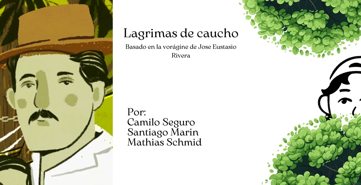
Lágrimas de Caucho is a web platform that transforms La Vorágine by José Eustasio Rivera into a visual and interactive experience. It combines interactive comics, weekly reading missions and community to bring classic Colombian literature to audiences who don't enjoy traditional reading.
72% of Colombians say they read, but only 26% do so by choice. La Vorágine is a canonical work but perceived as distant and difficult. The challenge was to reframe it as an experience — accessible, visual and emotionally connected — without reducing it to a simple summary.
I liked the comic part, but it needed more animation or sound.User · Test 1
The visual format hooks people, but deeper interactivity (audio, motion) is the next step for retention.
If it had more ways to interact, I'd spend more time on it.User · Test 1
The willingness to engage is there — the limit isn't interest, it's the depth of the experience on offer.
Easy to navigate, but I had trouble finding the characters section.User · Test 2
The overall architecture is solid, but some section names need revisiting to reduce friction.
Análisis del bajo índice de lectura voluntaria en Colombia. Identificación de La Vorágine como obra con alto potencial narrativo visual pero sin plataforma digital dedicada que la resignifique.
Análisis comparativo de Harry Potter (experiencia), Wattpad (comunidad) y Shire Post Mint (estética). Gap identificado: ninguna plataforma combina narrativa visual + educación + comunidad en un mismo espacio.
Definición de dos arquetipos: Busy reader y No lector. Diseño del flujo de navegación para reducir fricción: 5 pasos desde la entrada hasta lectura activa o misiones semanales.
Dos rondas: cómic vs texto (15 min vs 35 seg) y prueba de navegabilidad (32 seg para encontrar información, 3 clics promedio). Iteración sobre el naming y la profundidad interactiva del cómic.
Users spent 15 minutes in the comics section vs 35 seconds with traditional text. 75% explored the comics for more than a minute. Navigation was intuitive with an average of 3 clicks to find key information.